Imaginary Forces made the Se7en opening titles. The Mad Men main title sequence. Boardwalk Empire, Game of Thrones, and a catalog of broadcast identities and brand films that defined what motion design could be. Ever since Minority Report, the studio has been synonymous with modern, cutting-edge design and visual graphics.
What it didn’t have was an interactive practice. No UX process, no interaction design methodology, no infrastructure for digital work that responded to users. Everything the studio knew about craft existed in film and broadcast. I was brought in as the first Interactive Creative Director to build that practice from scratch.
Setting Up the Practice
A studio famous for film titles was building its interactive arm.
Client asks usually included forward-thinking UX and visual design, which let the team break out of everyday design constraints and push further than a normal brief. Interactive prototypes were also not an everyday practice at that time, which changed after my tenure there.

Masters Golf Tournament: Concept Work for Berckman Place
The Masters is special, it is beautiful, it is uncomplicated. It always exceeds expectations, and it always gets better.
— Billy Payne, Chairman, Augusta National Golf Club
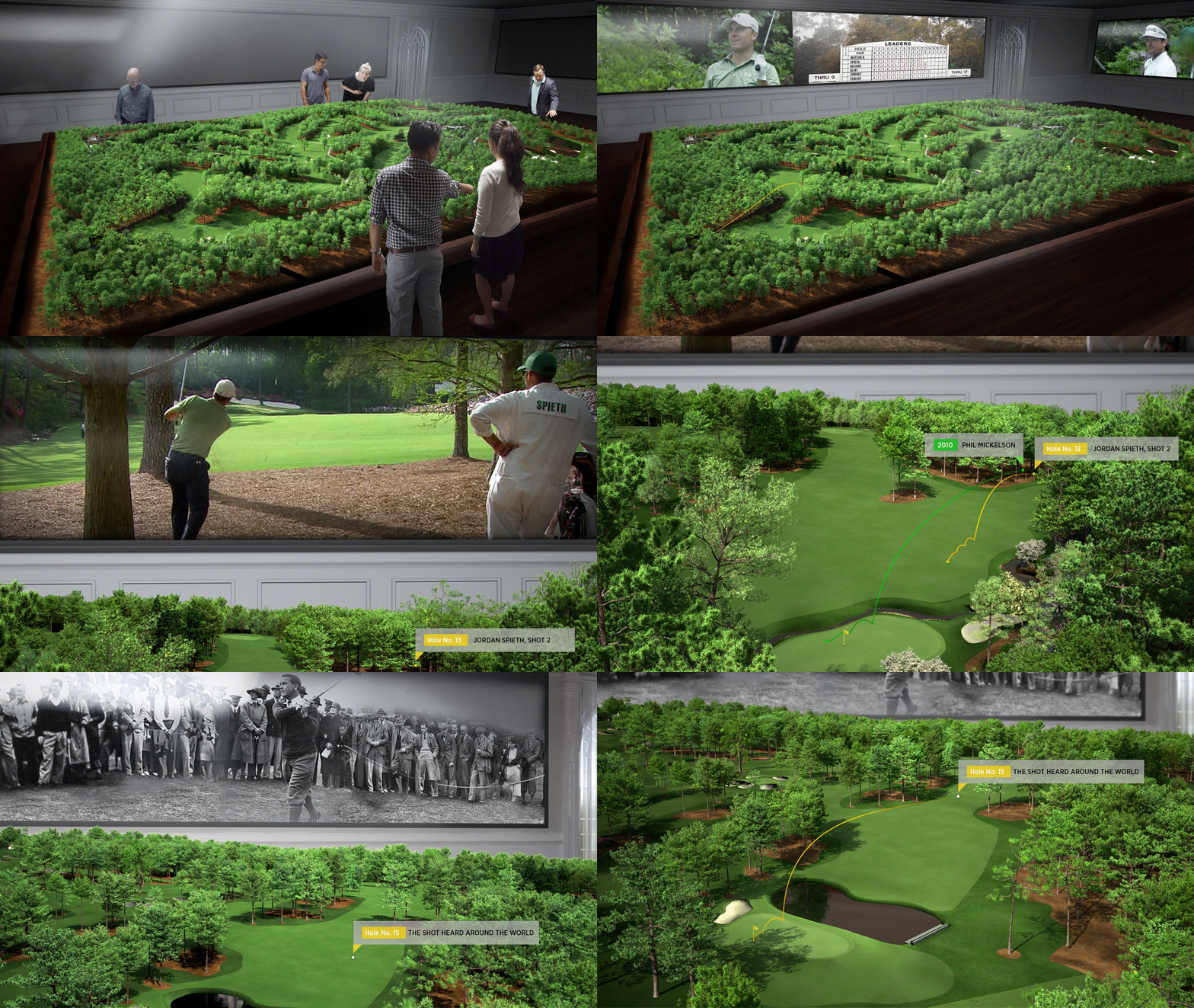
The Masters’ digital committee asked for “big thinking” over the next five years. The brief was for the elusive Berckman Place, Augusta National’s hospitality venue, and the ambition was spatial: an AR experience that would place live tournament data in the physical environment, tied to exactly where a guest was standing and looking.
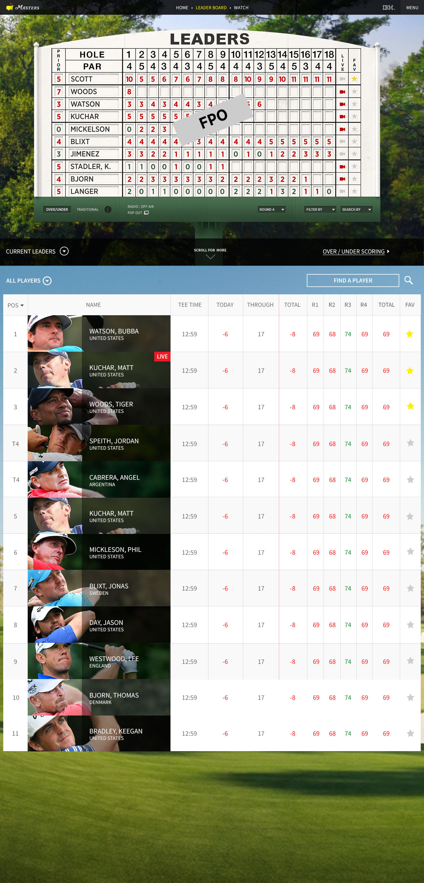
The leaderboard wasn’t a feature. It was the front door.
Before the concept work began, we asked where fans actually entered the Masters’ digital experience. Five entry points mattered, and they weren’t equal.
- ~72%
- Website leaderboard
- ~57%
- iOS apps
- ~38%
- Android apps
- ~35%
- Website homepage
- <10%
- Articles
Every architecture decision after that, from the on-site AR overlay to the mobile companion, treated live scoring as the center of the experience rather than a subsection of it.
What we developed combined four layers:
- Live streaming of tournament play.
- Historical tournament data.
- Real-time forecasting analytics.
- An AR overlay registering all of it to physical space.
In 2013–2014 this kind of spatial data overlay meant building it ourselves. Apple wouldn’t ship ARKit, its first public AR framework, for another four years.
Rather than looking down at a device, guests could orient toward the course and see contextual data in their view: the hole they were looking at, the players on it, historical scoring at that location, and projected leaderboard movement.
Wireframes and Information Architecture
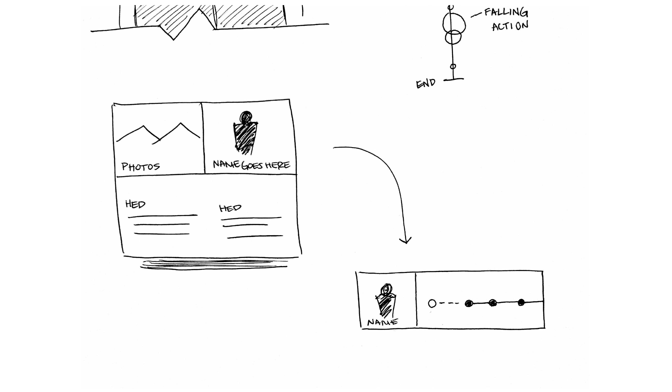
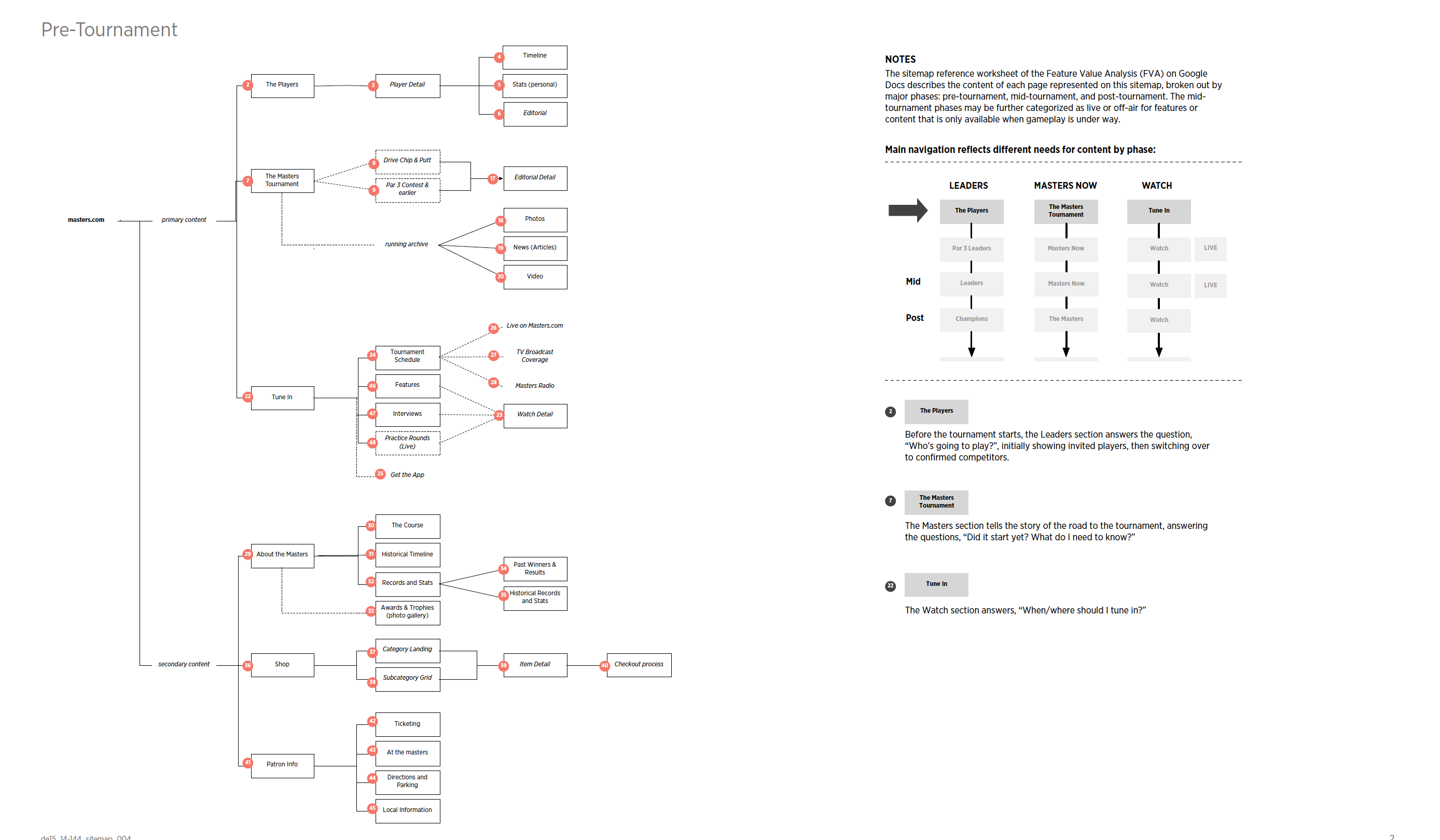
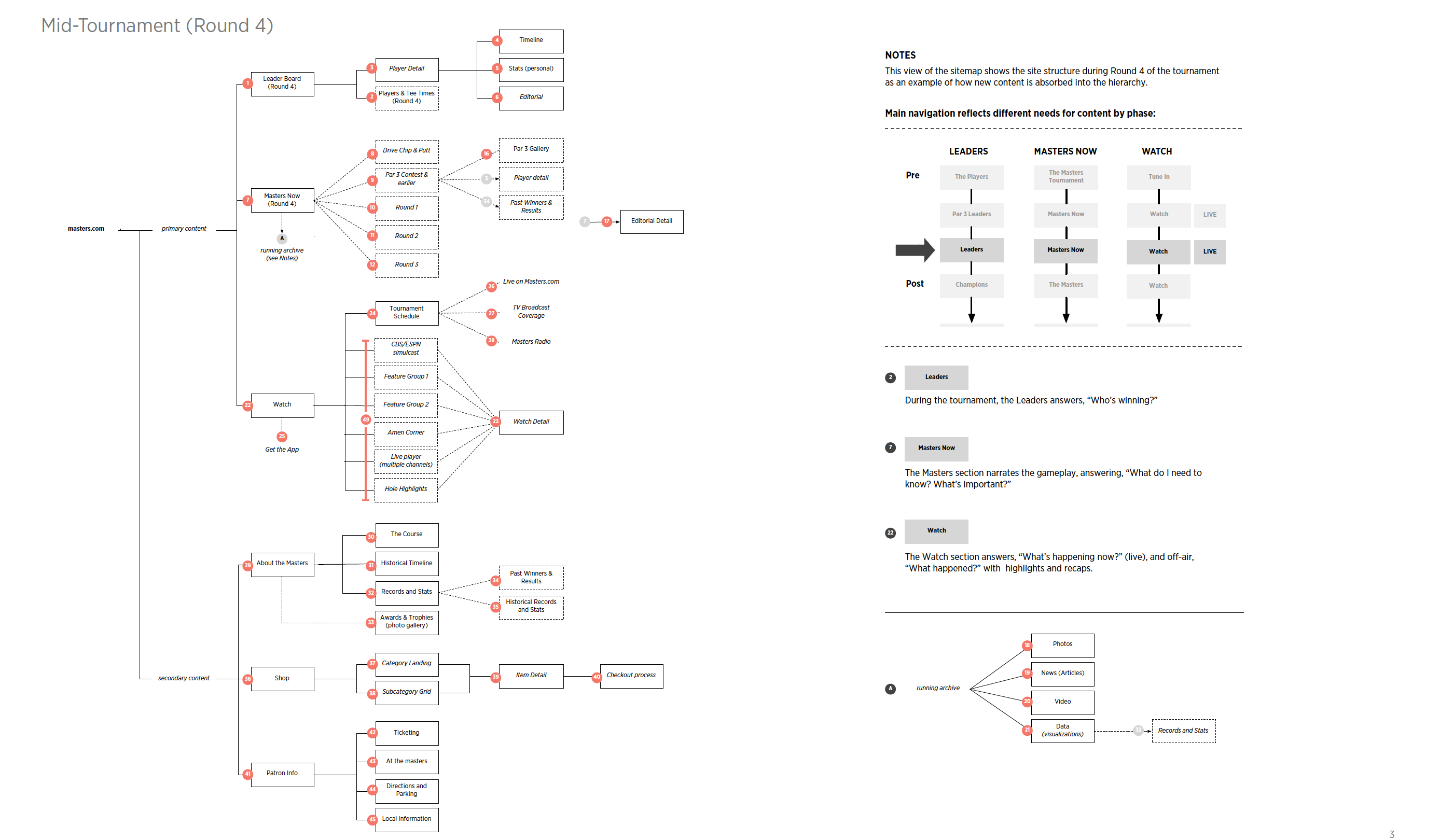
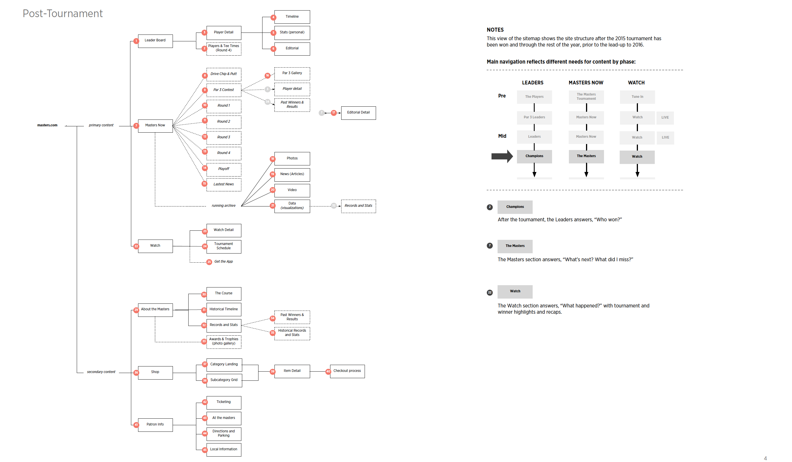
With four simultaneous data layers running at once (live streaming, historical records, forecasting, and spatial AR overlays), the information architecture problem was real. Nine wireframe sets mapped how tournament data, player stats, leaderboard states, and spatial overlays could be structured without overwhelming the user. The wireframes resolved the hierarchy decisions before any visual design began.
Masters — Wireframes and Information Architecture
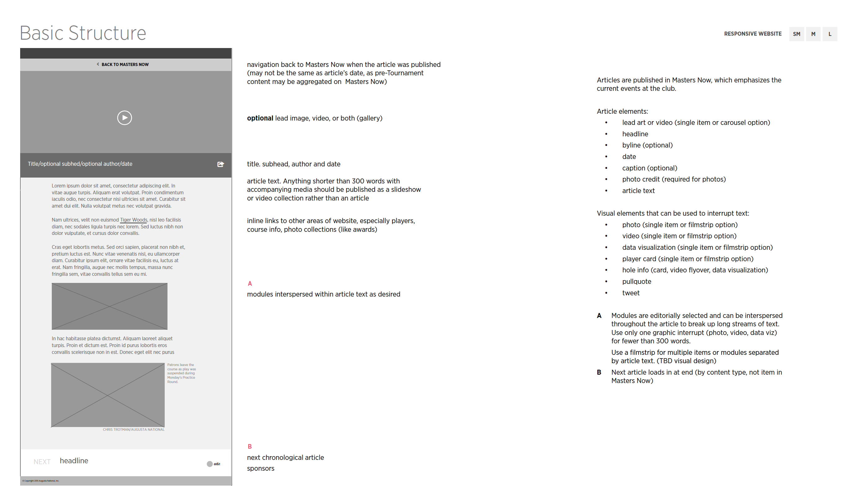 Information architecture
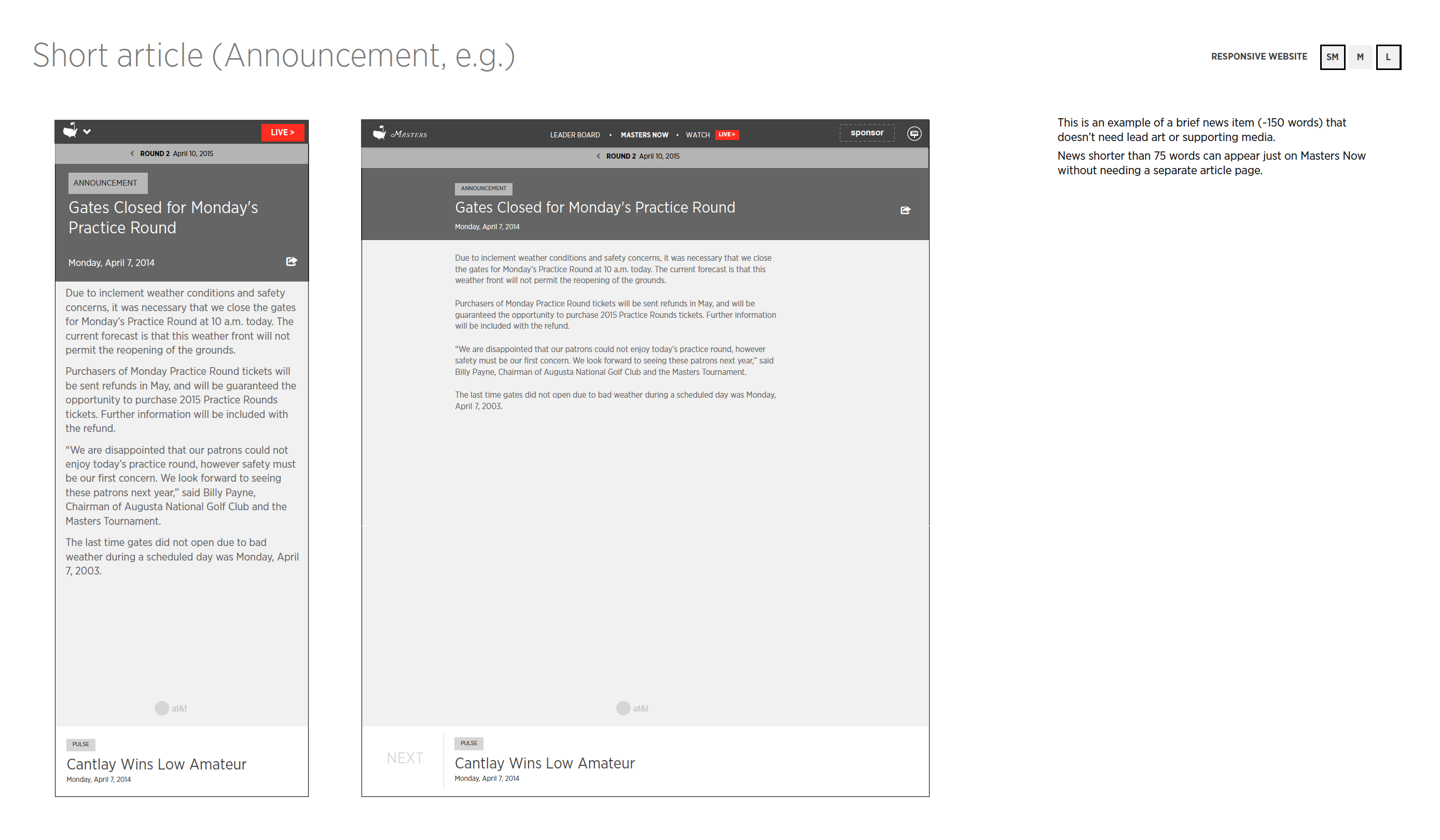 Leaderboard structure
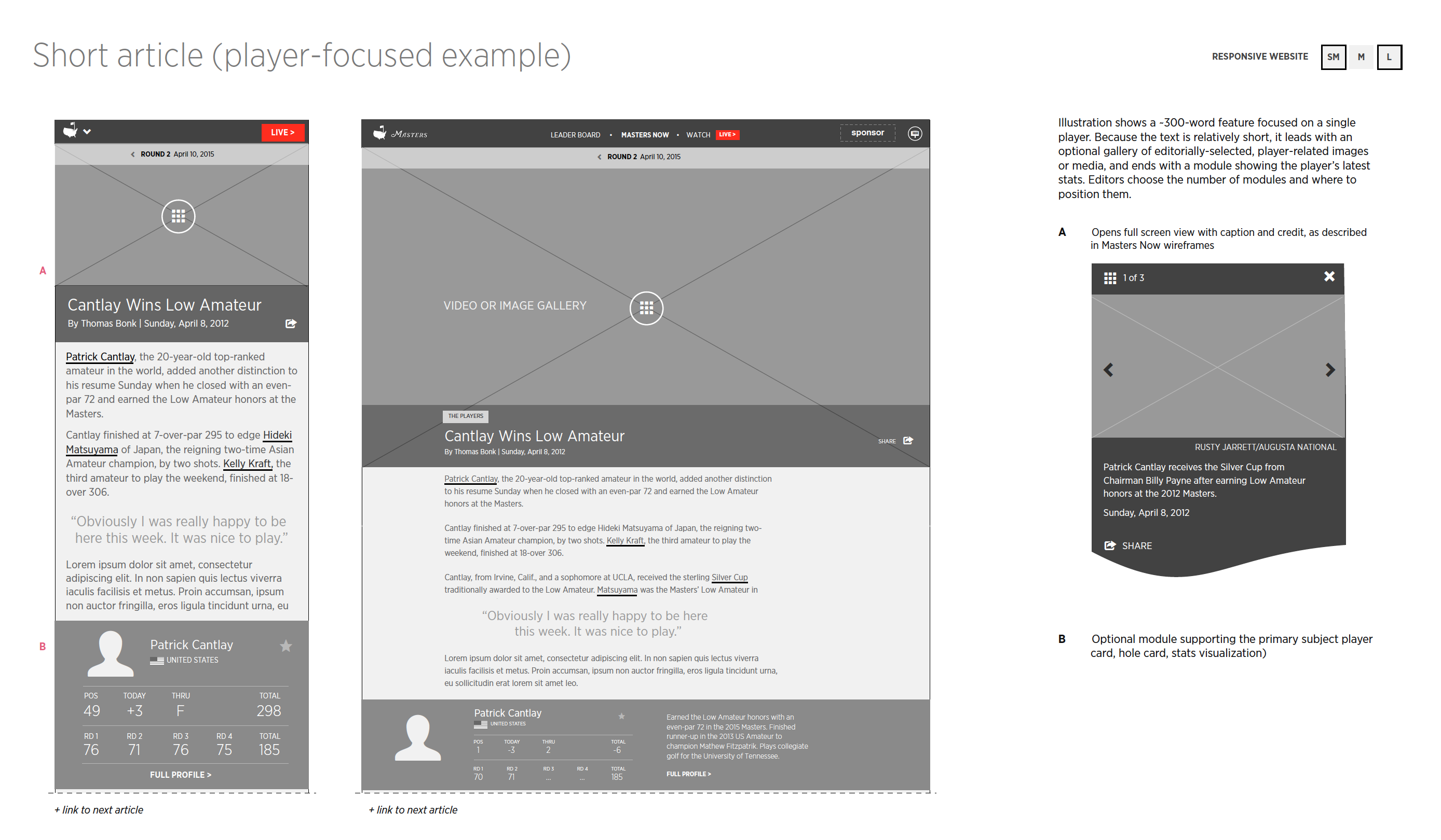 Course data overlay
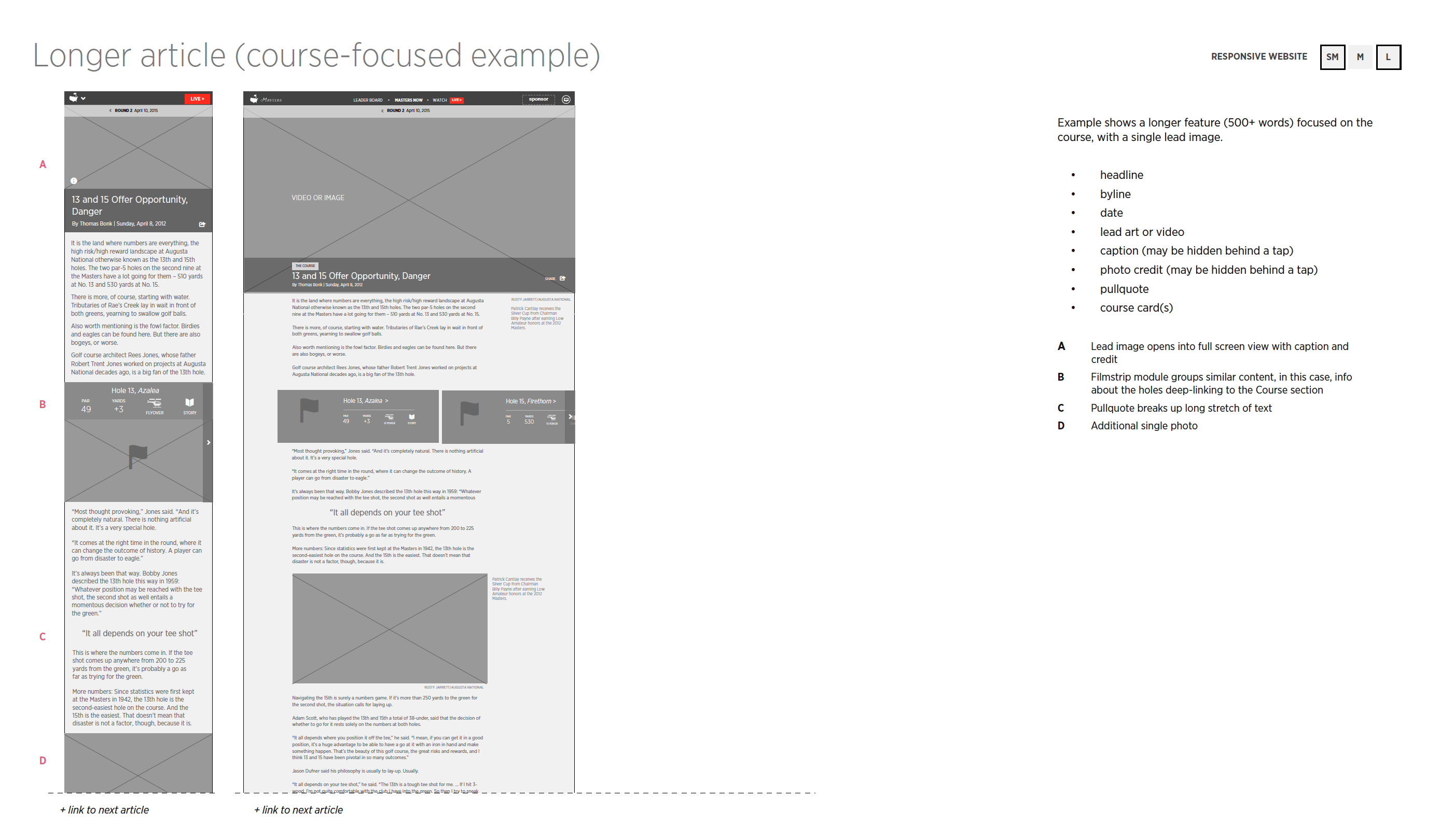 Player detail views
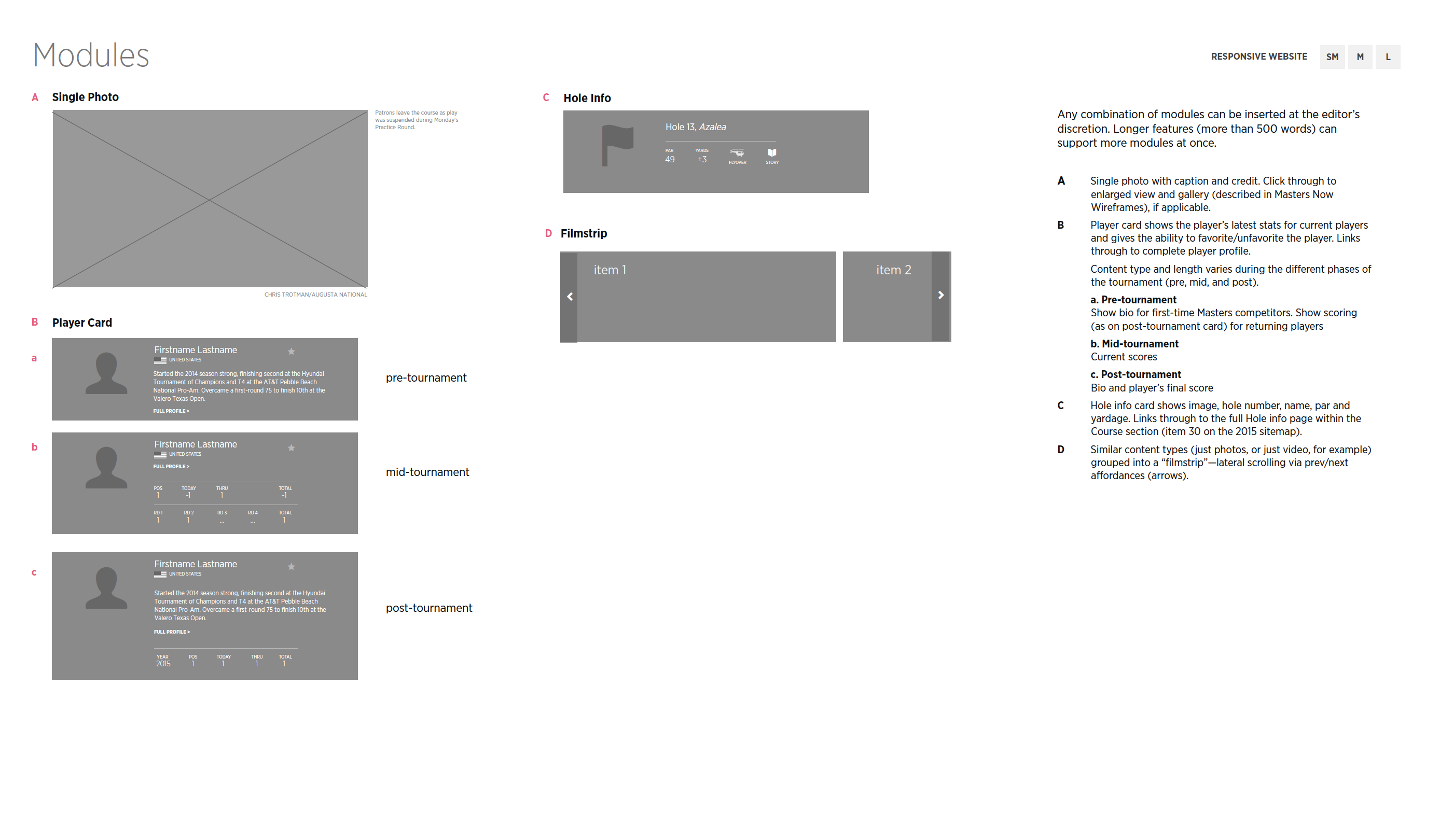 Alert system
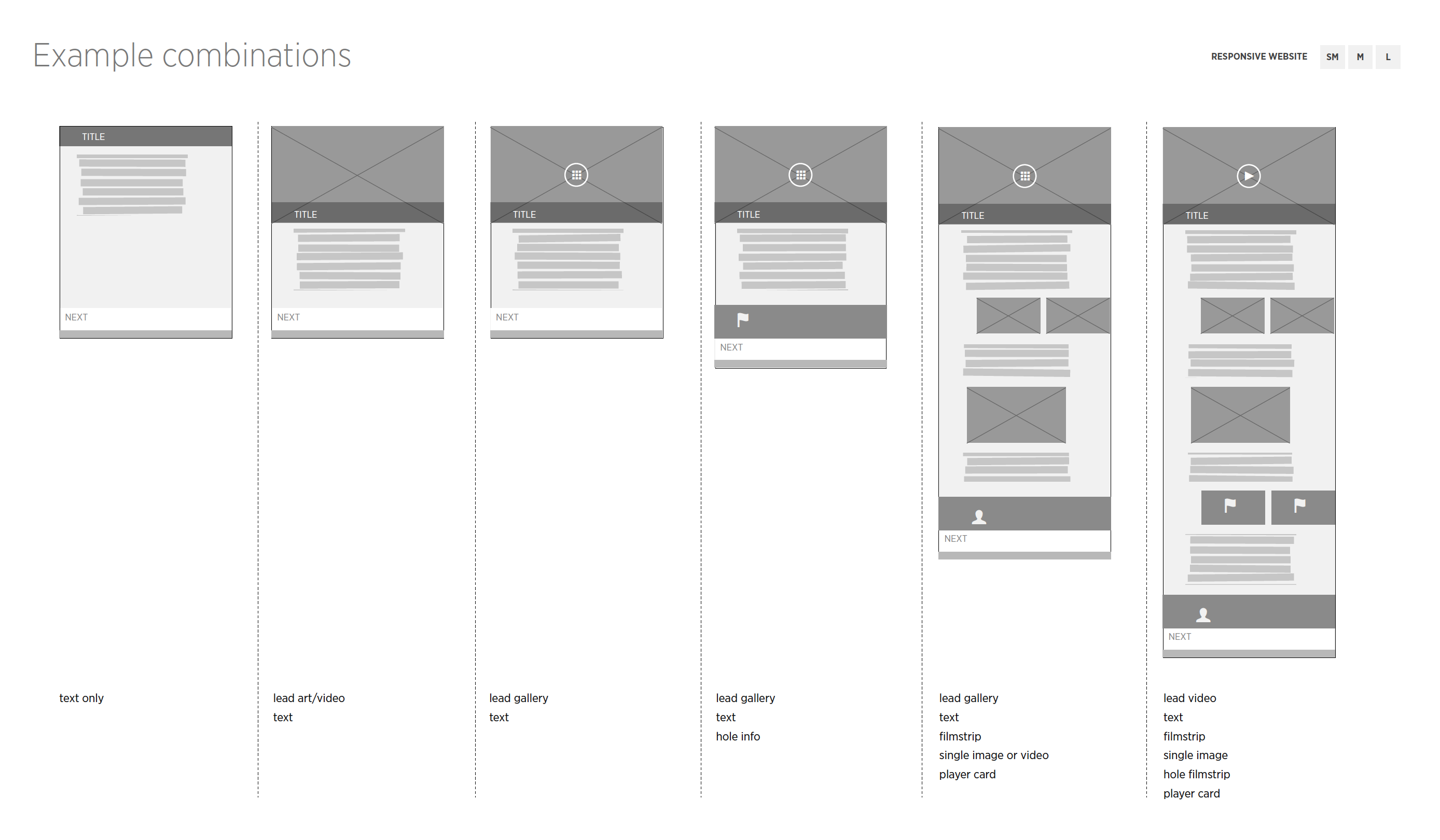 Personalization flows
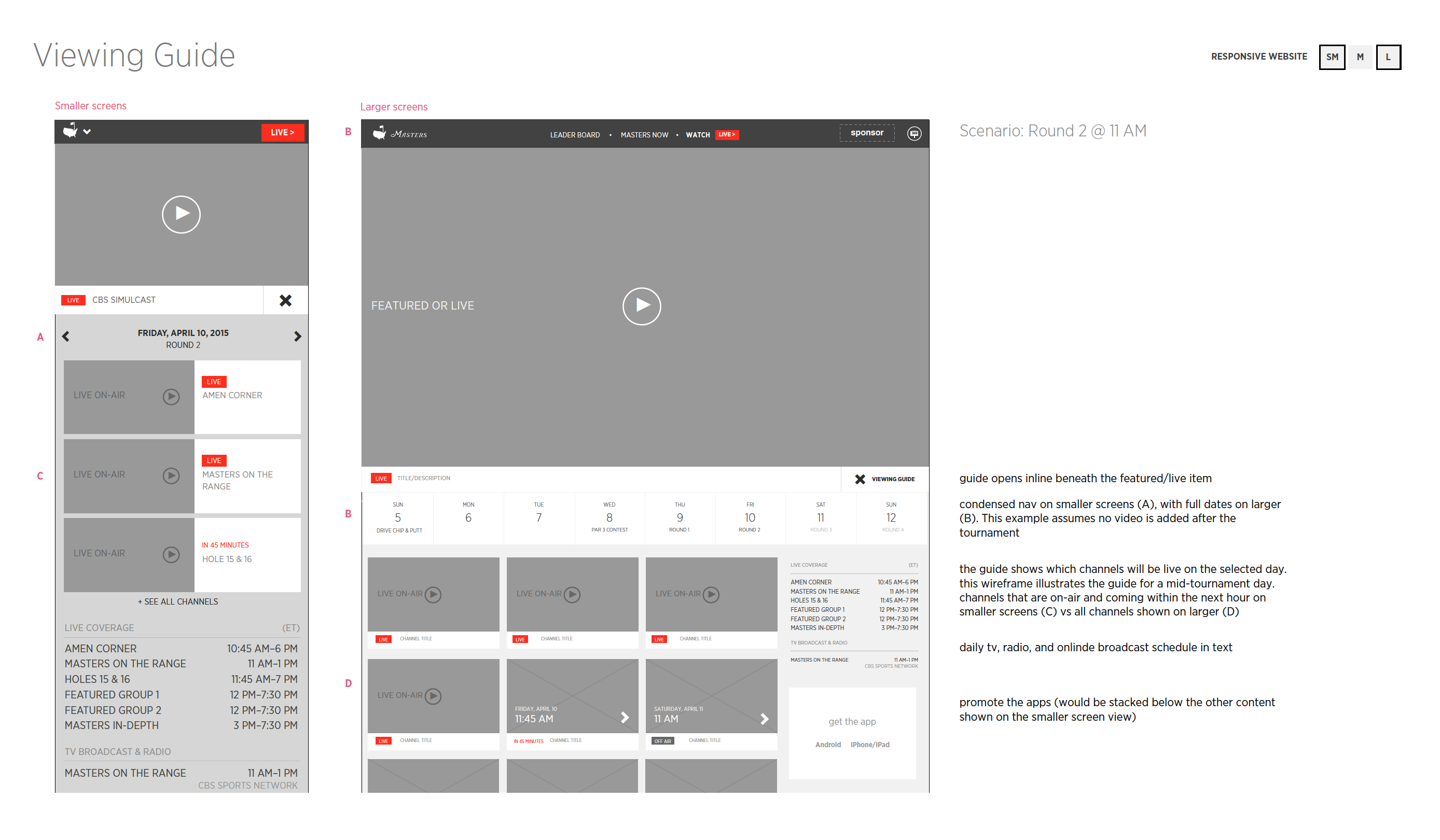 Mobile companion
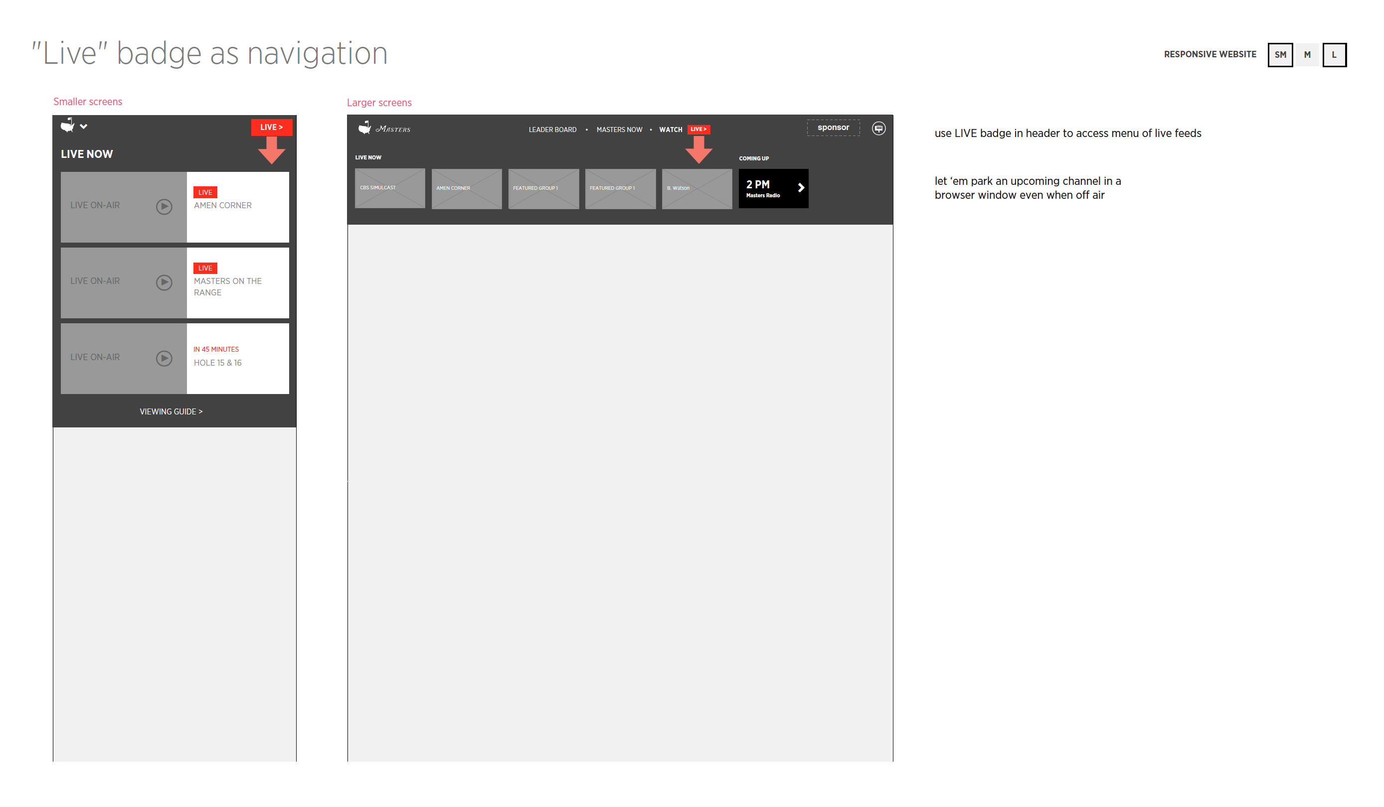 Analytics dashboard
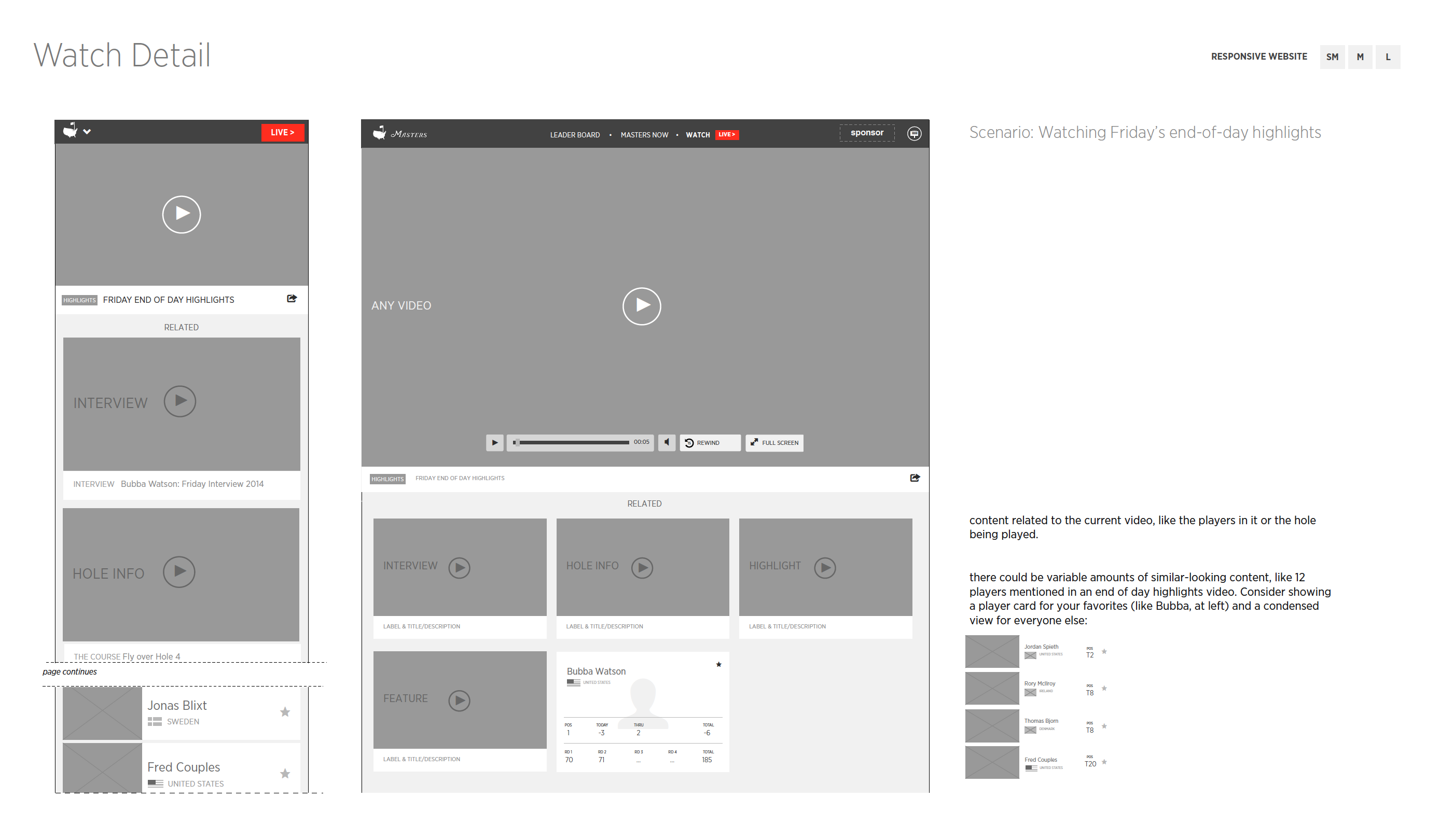 AR overlay composition
UX Design and Screen Development
The UX screens turned those wireframe decisions into concrete interfaces, resolving how layout, interaction patterns, and data hierarchy would actually behave on screen. This is where the abstract architecture became specific design.
Masters — UX Screens
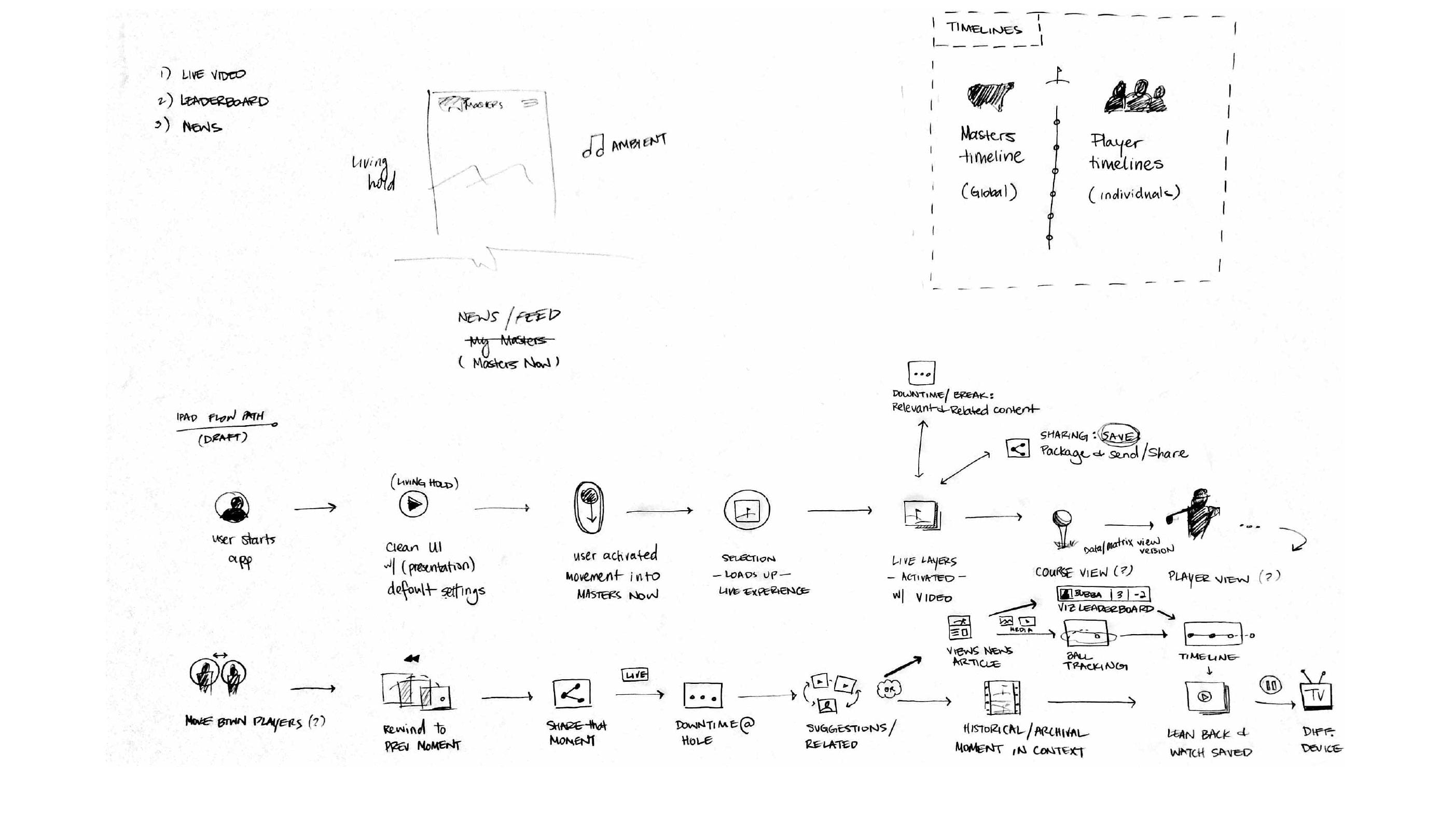 Experience overview
 Interaction detail
 Tournament landing
 Live scoring interface
 Content integration
Visual Design
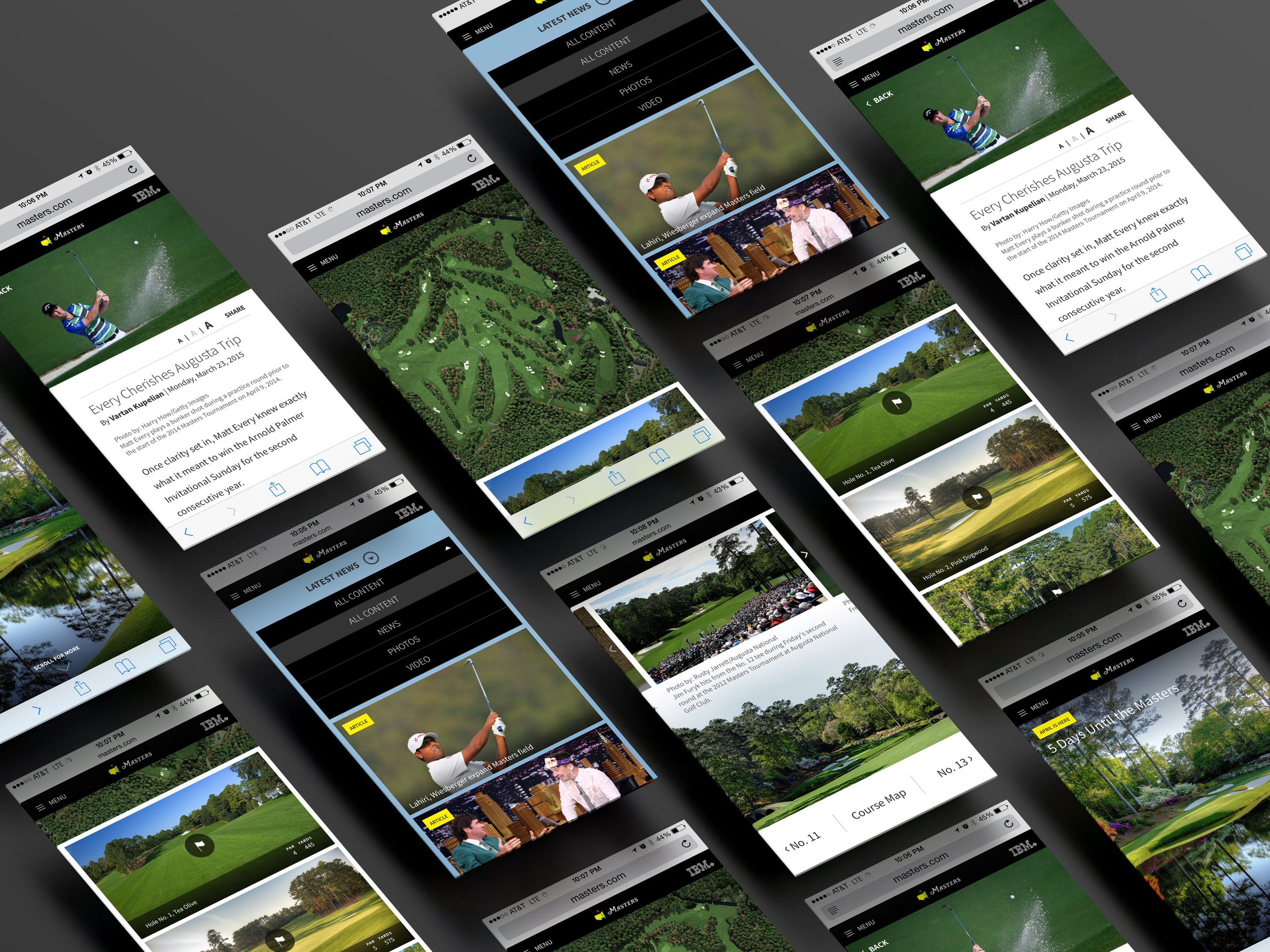
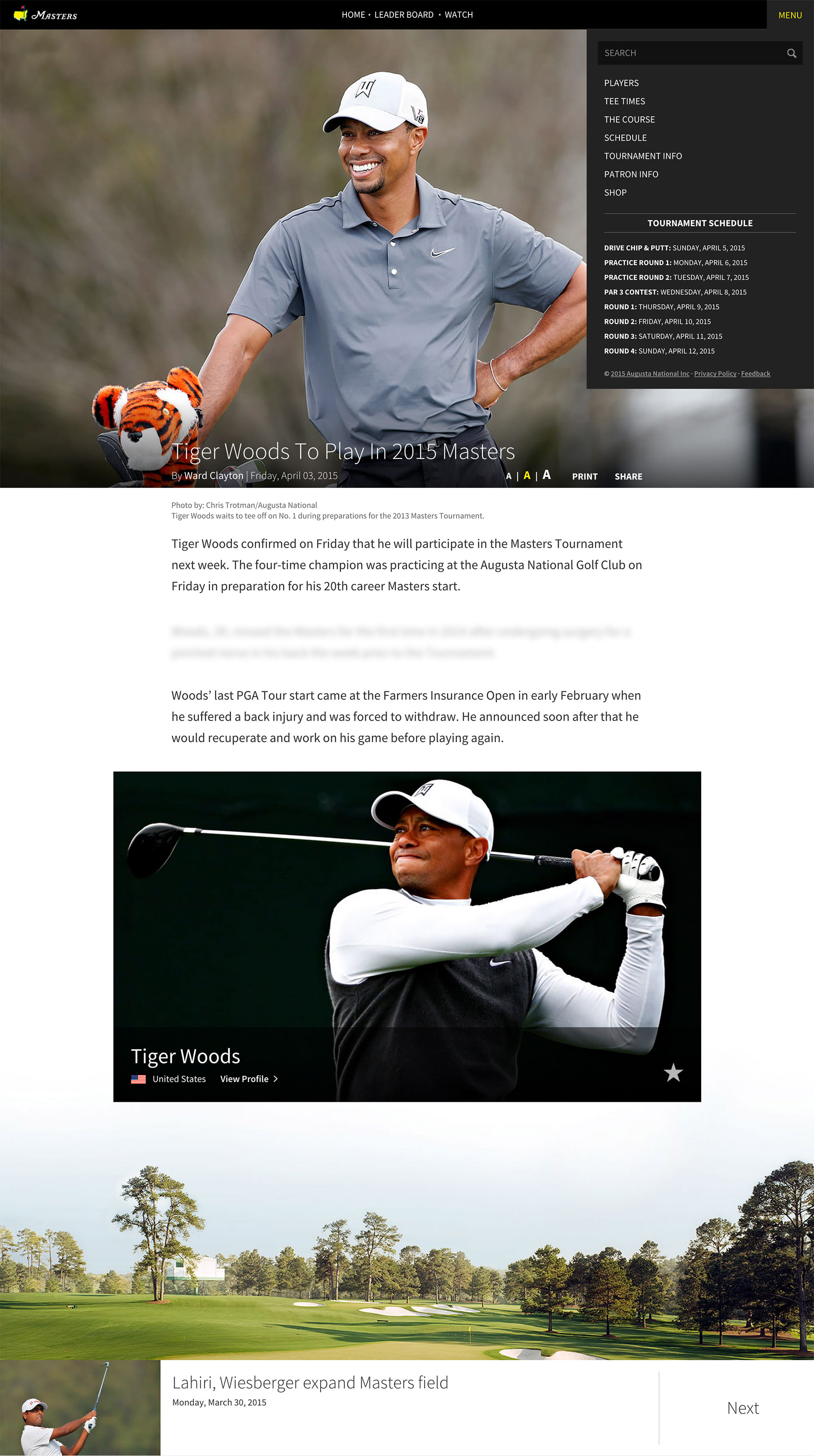
The visual design problem was a tension: Augusta National’s brand identity is understated, restrained, and prestigious. Real-time tournament data is dense: leaderboards, live alerts, player tracking, and editorial content, all competing for attention simultaneously. The visual design system had to hold both. The screens below show how that tension resolved across desktop and mobile.

Results
A budding UX/UI capability became a working part of the design studio.
Within a year I’d ramped up a team to take on the top billable client and helped establish the UX/UI practice at Imaginary Forces. The studio had its first custom online portfolio, built from the ground up inside a firm that had never needed one before.
The top client, a Fortune 50 CEO, responded to The Masters redesign with high praise, using multiple exclamation points (!!) to remark on the site and on the apps, which went on to receive 4.5☆ ratings and a top-25 download ranking on both Google Play and the iOS App Store.
Digital Designers Onboarded
App Downloads
Prototypes Built